


The London Underground processes 1.34 billion passengers per annum. It’s been a part of London life for more than 150 years, and Waterloo underground station alone sees almost 100 million passengers use its platforms and escalators every year. No wonder print advertisers see the London Underground as one of the most effective ways of reaching potential customers and clients. What lessons can print marketers learn from the recent crop of tube line posters?
Bigger is better
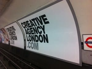
The tube is a blank canvas like few others for print advertisers. While small-format posters can be found lining the corridors and escalators of stations from Brixton to High Barnet, it’s the tunnels themselves where you’ll find the most effective tube ads. Many of the billboards that line the tunnels at London’s underground stations are the size of tube carriages themselves, and can’t fail to be clocked by the hundreds of thousands of daily users. It may be expensive to plaster a wall with an enormous print advertisement, but in this case at least, bigger is undoubtedly better.
Keep copy to a minimum…
Say what you will about TFL cancellations and delays, but for the most part the tube is a fast-paced environment. Trains are usually in and out of stations in seconds, and passengers don’t tend to hang around for long on platforms or in corridors. In this environment, a glut of copy is counterproductive. People won’t have time to read it, so unless your message can be communicated in a handful of words, they aren’t going to get it. Some of the most effective recent tube ads are heavily image-led and rely on very little copy indeed.
…and make it high quality
What copy you do use needs to be of the required quality. The recent TFL campaign about tube etiquette is a good example of how poor copy can undermine an otherwise effective print advert. The ads feature poems submitted by real London Underground passengers, but would clearly have benefitted from a little editing before going to print. The rhyme schemes are inconsistent and the phrasing awkward – hardly desirable for a polished, big-budget print campaign.
Remember your audience and take care
Tube ads have been at the centre of some pretty high-profile controversies of late. Protein World’s 2015 ‘Are You Beach Body Ready‘ campaign resulted in 380 complaints to the Advertising Standards Agency, and while the complaints weren’t upheld, the offensive ad was eventually pulled at great expense and significant damage to the company’s reputation. Gourmet Burger Kitchen’s ‘Vegetarians: Resistance is Futile‘ ad caused similar offence and controversy. These ads act as a cautionary tale to bear in mind the fact that the London Underground is home to a wide variety of audience demographics – an ad that might work with one group may alienate another.
The sheer cost of advertising on the London Underground will put off many smaller companies, but the lessons we’ve learned from tube posters and billboards can be applied to all other forms of print advertising. If you’d like your print campaigns to go with a bang this year, talk to PMG. Our expert design studio can help you to generate striking print campaigns sure to attract more attention to your business, products and services.

