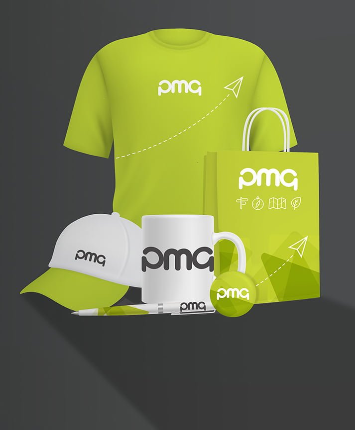
Strong print design involves a number of different elements, all of which contribute to the look and feel of your inside and outside print products. Arguably one of the most important considerations of all involves typefaces: the choice of which font (or fonts) should be used to represent your firm throughout any corporate branding, internal and external communications efforts. Although they may seem superficially insignificant, typefaces can have a major impact on how your brand and its printed materials are perceived by potential clients and customers. Here are four key points you ought to consider when choosing a typeface (or typefaces) for your brand.
Existing or bespoke?
There are countless thousands of typefaces in existence, from formal, professional-looking fonts to more niche or playful designs. Some of these, such as Arial, Times New Roman and Calibri, for example, come as standard with most software suites and can be used for internal or external communications without fuss or bother. It’s up to you to decide whether you want to use a standard or a non-standard font – if the latter, then many thousands of professional and user-generated typefaces can be downloaded from the internet and used under a variety of commercial licences. However, you may find that no existing typefaces meet your requirements, in which case you could commission a designer to create a bespoke typeface exclusively for your company. Though expensive, this last option means you’ll receive exactly the aesthetic you’re looking for.
Typeface connotations
One of the reasons why choosing a typeface can be particularly problematic for brands is that different typefaces have different connotations. That is to say, your choice of typeface will affect how viewers perceive your brand, based on how the typeface itself makes them feel. For example, serif fonts (those with adornments) are perceived as being more formal, or fussy, even, than sans serif fonts (those without adornments). A serif font might have the professional air needed for an accountancy firm, bank or newspaper, while a sans serif font might be ideal for a retail chain or tech start-up. A simple example regarding typeface connotations can be made using Comic Sans: you wouldn’t use this particular font in a letter to HMRC…
Legibility
Legibility is, naturally, a crucial consideration when it comes to selecting an appropriate typeface for your brand. It’s worth bearing in mind that certain typefaces are easier to read and comprehend in some contexts than others. Serif fonts, for example, can be easier to read in large blocks of text than sans serif fonts. Colour can easily affect the legibility of text, too, so if you’ve already decided on your brand colours or the colours of a forthcoming print campaign, be sure to pick a text shade that’s suitably legible. It’s worth bearing tracking and kerning in mind, too – these terms refer to the spacing of groups of letters and of individual letters respectively. The internet is filled with examples of these spacing fails that have led to the serious embarrassment of their perpetrators – or worse!
Multimedia considerations
Last but not least, you need to consider how your brand’s chosen typeface will play across various multimedia channels. The font you’ve chosen for your company logo might not work as well on printed documents or on your website, so it might be worth selecting a group of complementary typefaces that work well when combined but can also be used separately where they’re most effective.
If you need any advice regarding typefaces or other print design considerations, you’ve come to the right place. Here at PMG we offer print management services designed to improve your company’s relationship with print, as well as print design services to help you create winning outside print campaigns. Contact us today to learn more.


