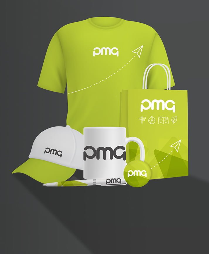
When most people think of print, the things that immediately spring to mind are things like business cards, catalogues and flyers. Next up are big, eye-catching outside print projects such as posters and billboards. Product packaging is often overlooked, but for many sectors it’s as important a print consideration as any other – if not more so. If you’re a retail brand then more likely than not your print packaging is the first thing your customers see when they’re making a purchase decision. With that in mind, it’s crucial that you get it right. Here are four things you ought to consider when it comes to developing your product packaging…
1) Colour connotations
Your product packaging may well mirror your brand’s colour palette, but this isn’t always the case. Companies such as Nestle have dozens of brands under a single roof, and couldn’t possibly have Aero, Smarties and KitKat all wearing the same brand colours. When you’re choosing the colours for your products, it’s important to consider how different colours have different connotations. Red might be an appropriate colour to use when packaging an energy drink – as it suggests power and alertness – but it wouldn’t be quite so effective if the product you were selling was a migraine remedy. Other colours, such as blue, are considered more calming and soothing. Also worth considering is how different audience demographics might respond to different colour combinations.
2) Typography
Typography is a big part of print design, and again much of it comes down to connotation and how certain typefaces are perceived by the viewer. Serif fonts are generally seen as being more formal, professional and old fashioned than sans serif fonts, which can often be more laid back and approachable. It’s likely that one will be far more appropriate for your product than the other. Typography is also crucial in determining the legibility of your copy – customers need to know what they’re buying after all. Be sure that your chosen typeface matches the product and that it’s legible enough to be read and understood with ease.
3) Environmental impact
Product packaging is often a trade-off between functionality and environmental impact. Food packaging, for example, needs to be able to protect its contents in transit and provide the maximum shelf life, but too much cellophane and too many layers of packaging will result in an environmentally unsound product. Often, sustainably sourced paper and card provide an environmentally friendly, robust and attractive packaging option for a variety of different products. Consider how the packaging you use might impact the environment, and how you can minimise packaging quantity without jeopardising the product itself.
4) Print design
We’ve touched on print design in terms of colour and typography, but there are still aspects such as imagery, layout, shape and aesthetics to consider before your packaging hits the shelves. Strong package design can increase the value of your products by a significant margin, with branding helping to determine whether products are considered ‘premium’ or ‘value’ by consumers. Packaging design should take into consideration your audience demographic, the retail sector and the nature of the product itself. It’s an art form, and not something that can be approached with a laissez-faire attitude.
Here at PMG, strong print design is our forte. We’re dedicated to improving our clients’ relationship with print, whether by reducing wastage and expense or winning new customers through clever print marketing campaigns. Contact us today to find out how our design studio could help you produce winning product packaging.


