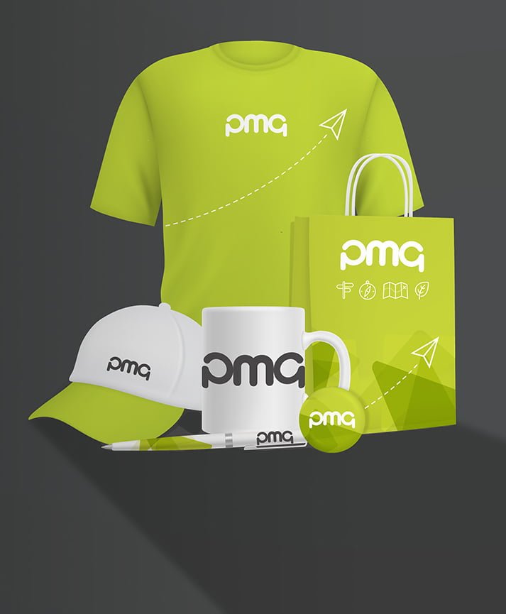
Your brand. It’s a vital way to tell your customers about your story, culture, and the experience you give as a business. It’s the essence of your organisation’s personality and lets people know what they can rely on you for.
Some people confuse a brand with just a logo. Although your badge is an important part of your identity, a logo is only one element of a brand. From organisational values to how you communicate, your brand is an opportunity to show off your personality and stand out from the crowd.
So, what other components are essential in achieving a genuinely punchy brand? Here’s our top three:
A stand-out colour palette
There’s no doubt about the impact of colour in marketing. One of the main aims of a brand identity is to be eye-catching in a jam-packed marketplace.
Colour can prompt an emotional response like feeling relaxed, energetic, or calm. The biggest names on the planet use this so successfully, you can recall their iconic branding from memory within seconds. Harley-Davidson? A rocking orange, black, and white. Coca-Cola? High energy red and white.
Some brands use a spread of colours for universal appeal, eBay for example, but interestingly, 95% of top brands only use two colours in their logo. Simplicity is key.
Striking typography
Another essential element of a good brand is the typography you choose (that’s the presentation of text, fonts, and typeface you use). It reinforces a brand’s meaning and recognition alongside other visual elements.
The National Trust strong and instantly-recognisable font meant its recent television ads stood out to connoisseurs as being made by the brand before any logo or mention of the brand was made. (Incidentally, the font was designed specially for the National Trust and is based on an engraving at Stourhead, one of its properties.)
Another great example of recognisable typography in action was the 2020 McDonald’s advertising campaign. Not only did billboard marketing drop the logo, but it also avoided using the iconic red and yellow brand colours. Instead, the campaign only used typography in the most minimal of ways. How bold is that?!
Employing a brand guardian
If you’ve sorted killer aesthetics and the ethos of your brand, it’s vital to have a brand guardian. Nailing down your brand guidelines is only useful if you have people to police them.
A consistent brand works across media, from digital designs to the all-important print elements that can drive online purchases. The future of a business relies on brand loyalty and gaining trust from your customers. Research shows that consistent branding across all channels can increase revenue by up to 23%, so it really does pay to have a clear message and stick to it.
Our clever design studio will always ask for your brand guidelines so we can ensure anything we produce is consistent, but is everyone in your organisation so diligent?
Need help with your brand?
If you want experts on your side, then we’re here to help safeguard your brand in print. Our design studio designs for print all day, so the team has oodles of knowledge that can help you with every print project. Give our friendly bunch a call on 01924 284330 for advice about what a strong brand needs to make your next print marketing project a success.


